Dawn Illumination Across Eight Square Metres
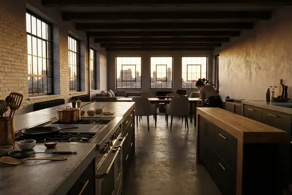
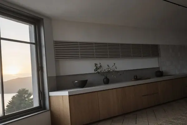
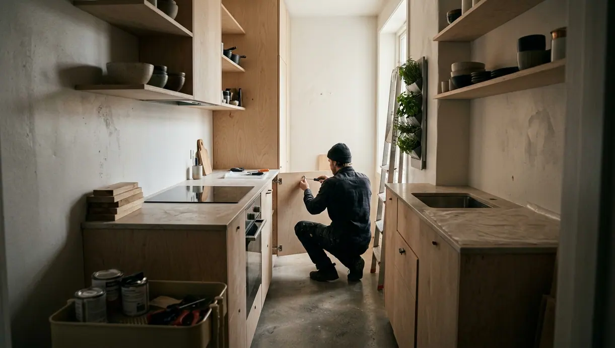
Step into the narrow Oslo kitchen at 06:00. The east-facing window channels early light directly down the corridor, striking the surfaces before the city fully wakes. The quality of this Nordic morning light is sharp and horizontal, raking across the room and exposing every architectural detail. Mapping the sun's trajectory between 06:00 and 09:00 dictated the placement of the primary prep zone. The continuous work surface catches this morning light perfectly, remaining entirely free from the shadows of upper cabinets during the crucial early hours of the day.
The core architectural challenge presents itself immediately upon entering the room. Fitting a full culinary workspace into a strict eight-square-metre footprint requires absolute discipline. Every millimeter carries weight in a space this confined. The design cannot afford dead zones, poorly calibrated clearances, or bulky transitions between materials. Morning light exposes the geometry of the room, highlighting the necessity for precision in the cabinetry alignment. When the footprint is this restricted, the architecture must work flawlessly to prevent the environment from feeling claustrophobic.
Observing the space at dawn reveals the success of the initial spatial planning. The light travels unimpeded from the window to the far threshold. This unobstructed visual pathway establishes a sense of calm before the heavy functional demands of the day begin. The room waits, highly calibrated and perfectly still, ready to support complex culinary tasks within its minimal boundaries.
Cubic Volume Over Floor Area
Floor-to-ceiling cabinetry extending 2.74 meters high redefines the spatial boundaries of the room. Maximizing cubic volume rather than square footage allows the architecture to absorb the heavy functional requirements of a modern kitchen. When the floor area is severely limited, the vertical plane becomes the primary asset. Integrated appliances, including the refrigerator and dual ovens, sit within these 600mm deep tall units. This configuration maintains a flush, unbroken corridor that guides the eye straight toward the window, concealing the visual bulk of the machinery.
Managing Visual Weight
To prevent these towering structures from feeling oppressive, the specification called for a matte, light-diffusing oak veneer. High-gloss finishes were bypassed to maintain a softer, more architectural presence that absorbs rather than reflects the ambient light.
The hardware remains entirely concealed. Push-to-open mechanisms keep the vertical planes uninterrupted, creating a monolithic block of storage that feels like an interior wall rather than applied cabinetry. These vertical reveals only align if the site is meticulously leveled before installation begins. A deviation of even two millimeters at the base translates to a significant, visible gap at the 2.74-meter mark. The installation team utilized laser levels and custom shims to ensure the oak veneer panels aligned with mathematical precision.
The internal configuration of these tall units is equally rigorous. Heavy-duty pull-out pantries utilize the full 600mm depth, bringing items stored at the very back out into the light. Cabinet boxes must support the immense weight of these loaded pull-outs, requiring reinforced side panels and heavy-gauge steel runners. The result is a storage architecture that maximizes every available cubic centimeter without imposing on the narrow walkway.
Linear Continuity Along the Primary Wall
The initial schematic explored staggered counter depths to accommodate a larger freestanding range. That approach was discarded in favor of a strict 620mm continuous depth along a 3.2-meter unbroken linear run. That clean visual line creates a distinct illusion of expanded space within the tight galley. The eye travels along the 3.2-meter run without encountering a single physical interruption. Flush-mounted sinks and induction cooktops integrate seamlessly into this horizontal plane, requiring precise CNC routing of the countertop material so the appliances sit perfectly level with the surface.
Total countertop capacity drops slightly by avoiding deeper appliance bump-outs, but the uninterrupted visual flow compensates by reducing clutter. A staggered counter creates shadow lines and visual stops; a continuous 620mm depth creates velocity. The material selection for the wet zones involves high-grade stainless steel. Relying on the passive, self-healing properties of Chromium oxide, the steel maintains a pristine, corrosion-resistant finish under heavy daily use, even when exposed to acidic culinary ingredients.
Fabrication techniques keep the sink basin welds entirely invisible, further supporting the unbroken aesthetic. The transition from the stone prep area to the steel wet zone is handled with a hairline silicone joint, color-matched to disappear entirely. This relentless pursuit of continuity demands exceptional coordination between the stone fabricator, the metalworker, and the appliance installer. The payoff is a primary working wall that feels expansive, despite the strict limitations of the eight-square-metre room.
Ergonomics and Cross-Illumination
A galley corridor must support movement without friction. The floorplan establishes an optimal 1100mm clearance between opposing counters, ensuring two people can pass without collision. This specific dimension is critical. At 1000mm, the space feels pinched when appliances are opened; at 1200mm, the pivot distance between the prep zone and the pantry becomes inefficient. The 1100mm clearance strikes the balance required for a high-functioning culinary workspace.
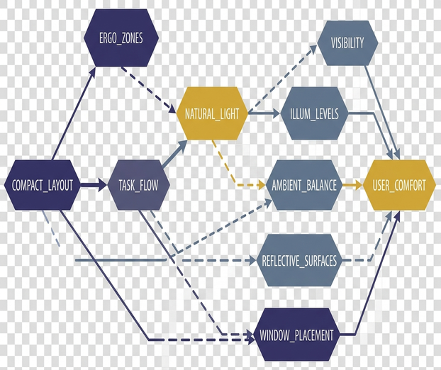
Lighting plays a structural role in this narrow plan, shaping the perception of width. The scheme layers 3000K LED strips recessed into the underside of the upper cabinets with narrow-beam architectural downlights. Placement was calculated so the fixtures cross-illuminate the corridor. This layering eliminates the dark tunnel effect that frequently plagues narrow galley layouts. The light bounces off the opposing surfaces, filling the 1100mm void with even, shadow-free illumination.
The 3000K color temperature provides a warm, residential feel while delivering sufficient lumens for precise knife work. Positioned at the front edge of the upper units, the under-cabinet strips cast light back toward the backsplash, washing the vertical surface and reducing shadows on the 620mm deep prep zone. Narrow-beam downlights pick out the floor, drawing the eye down the length of the corridor and emphasizing the linear geometry of the space.
Structural Constraints and Air Quality
The physical limits of the eight-square-metre footprint force specific compromises, particularly regarding blind corner cabinets where access remains inherently restricted. Rather than installing complex, space-consuming corner mechanisms, the design voids the deepest corners entirely, reallocating that budget to higher-quality drawer hardware in the accessible zones. Ventilation presents a more rigid architectural constraint. Installing high-capacity extraction in a confined, older apartment structure requires precise routing and significant problem-solving.
The design team engineered a custom 120mm shallow plenum above the ceiling line to house the ductwork without dropping the overall ceiling height. Meeting indoor air quality guidelines in such a tight space is non-negotiable, as cooking odors and moisture quickly overwhelm a small footprint. Feasibility, however, hinges on a single condition: the original 1920s ceiling joists must run parallel to the duct path.
Ventilation Routing Feasibility
Perpendicular load-bearing timbers would prohibit this concealed ventilation strategy entirely, forcing the ductwork below the ceiling line and compromising the spatial volume.
While these spatial models provide a reliable baseline for urban renovations, site-specific load-bearing assessments dictate the final structural interventions. Acoustic dampening within the 120mm plenum keeps the high-capacity motor quiet, preventing the extraction system from dominating the acoustic environment of the small room. The rigid ducting is taped and sealed to prevent any pressure loss along the route to the exterior vent.
The Choreography of Dinner Preparation
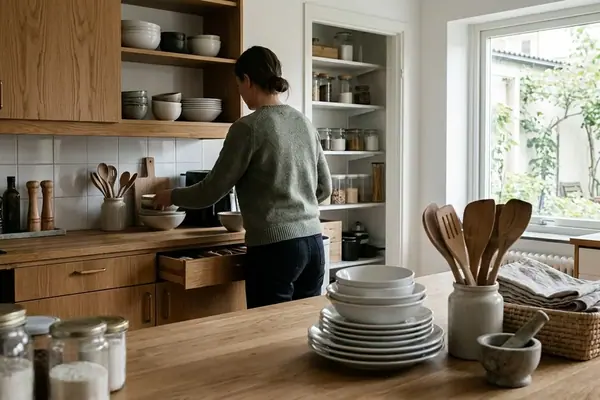
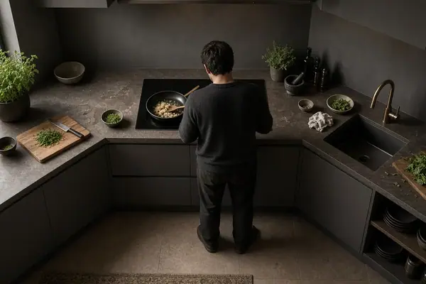
The true test of the architecture occurs during the evening service. Two people move through the simulated dinner preparation sequence as the natural light fades from the east-facing window. One cook pivots a full 180 degrees from the integrated pantry to the primary prep zone, a distance finalized specifically to minimize steps during active cooking. The movement is tight, controlled, and entirely fluid. A heavy cast-iron pan is pulled from a deep lower drawer, landing on the flush-mounted induction surface with a soft thud.
The other cook slides along the 3.2-meter continuous prep zone, moving chopped ingredients toward the cooking surface. They pass each other in the 1100mm corridor without breaking rhythm, the clearance proving just sufficient for the choreography of a shared meal. Matte oak veneer absorbs the warm 3000K downlights, casting a soft glow across the corridor, while the extraction system hums quietly within its shallow plenum overhead, pulling steam away before it can settle on the surfaces.
Water runs over the high-grade stainless steel sink, the Chromium oxide layer repelling the moisture instantly. Push-to-open cabinets click shut with a solid, dampened sound, concealing the pantry ingredients and restoring the monolithic appearance of the tall storage wall. The tight corridor acts as a highly calibrated instrument, supporting the rapid rhythm of slicing, searing, and plating without a single wasted motion.